Update 9/5/2024. I am now listing multiple accounts within a bank object rectangle in my diagram — for a few accounts. E.g. a line for checking and a line for savings. I put the approximate balances in K dollars on each line. Sometimes I might have to make the rectangle larger to accommodate three accounts within the same bank. For CD account dollar amounts I use a very faint orange instead of the typical orange font color, since this money isn’t as liquid. See towards end of document for screenshot of what I am talking about.
Update 9/2/2024. I’m now keeping balance information in the chart as well, finding it really helpful. In a single visual, not only do I see all accounts, their status, what I must do each month with them, all the possible paths of flow of cash, but I also see the balances. See the end of this article for a screenshot and more information. Additionally I discuss below how I color code the DD labels to track status of monthly DD’s for each account.
Update 6/9/2024. I have updated quite a bit here in the past couple days. Lots of new exciting features plus a video.
Originally posted on 6/6/2024:
In this bank account bonus hunting hobby, I found by having a large number of bank & brokerage accounts open at any given time it can become quite unmanageable unless I have a few things in place:
- Tracking all transactions with personal finance software — I use the free GnuCash.
- Monthly spreadsheet which serves as both a bill payment checklist as well as for planning cashflow for the given month. I’ll share this spreadsheet of mine in a blog post sometime in the near future.
- Bonus Hunting tracking spreadsheet similar to the one RJ of Profitable Content uses in his video.
- Using journaling software to track each bank account — I use Day One which allows me to read/edit my journal entries on my Mac, iPad or iPhone anywhere in the world. In the journal entry I can add any amount of text along with links, photos, screen shots, bank agreement PDF’s etc. I’ll do a blog article on how I journal with this software for bonus hunting at a later date.
However with all the above, one thing I was missing was a diagram of how all the bank accounts are linked together. It was hard to recall which accounts were l linked to what, having to log in each time to find out.
The other day I thought it would be very helpful to create a diagram — using the free Draw.io software similar to Visio — which displays all the links between the banks. I could then just keep this diagram up to date every time I create a new link. I would then have a single page to look at which displays the entire set of links, making it very easy to recall what is linked to what. Also by having these visuals it really makes it easier to plan and improve my strategy.
So I created the diagram with all the links in Draw.io. Everything was in black and white initially. Then I figured I could color code the bank accounts based on the type of account or status of the account. This really helps as well. You can color code to your liking; this diagram will evolve and improve as I use it.
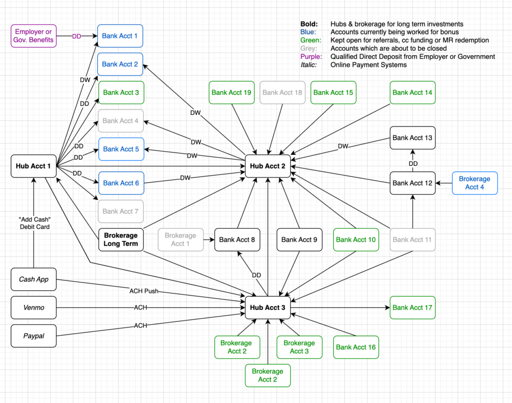
The diagram below is of my actual set of current accounts and how they are linked — I have removed the names of the banks for privacy.

The directional arrows in the diagram do not indicate cash flow; they indicate the direction of the link. E.g. Bank Acct 19 above has an external link to Hub Acct 2; if the arrow had been going the other direction it would be: Hub Acct 2 has an external link to Bank Acct 19.
The only cash flow indicators are the DD & DW in the diagram above. DD is for Direct Deposit and DW is what I call “Direct Withdrawal”. I use these for accounts I am currently working for a sign up bonus or for those accounts where I have to do a DD to avoid a monthly bank fee. I only use DW notation for a particular account when there is an associated DD. I typically log into Hub Acct 1 and push a DD to a bank account I am working; later after that posts I use Hub Acct 2 to “Direct Withdrawal” that money. (I don’t like using the same hub to both push and pull for the DD/DW as I feel it might upset the banks, so I have a second hub for withdrawals.)
By the way, I color code the directional arrows red when the account is not yet linked but in process. Once the microdeposits have been verified I change the color from red to black. This diagram visually reminds me to finish making the link by verifying the microdeposits — too easy.
Again this diagram will evolve and be improved upon. I just was excited and wanted to post about it today.
I really love this diagram and it will improve my game. It will be loaded with a bunch of useful information, for all of my accounts, all on a single page. I can screenshot the page once per month and journal it to see how the diagram evolves over time, also serving as a historical archive. I will be updating this diagram every time I open up a new account, every time a new link is created as well as when I need to update the status of the account, etc.
Note: I am using the desktop version of Draw.io for Mac OS and saving files locally. I found it performs very well on my Mac Mini Pro M2.
Additional Features
Searching the page. To quickly find within the page where a particular bank is, I use the find feature of the app and type in a few letters. On the Mac this is CMD-F and on Windows I presume it is CTRL-F.
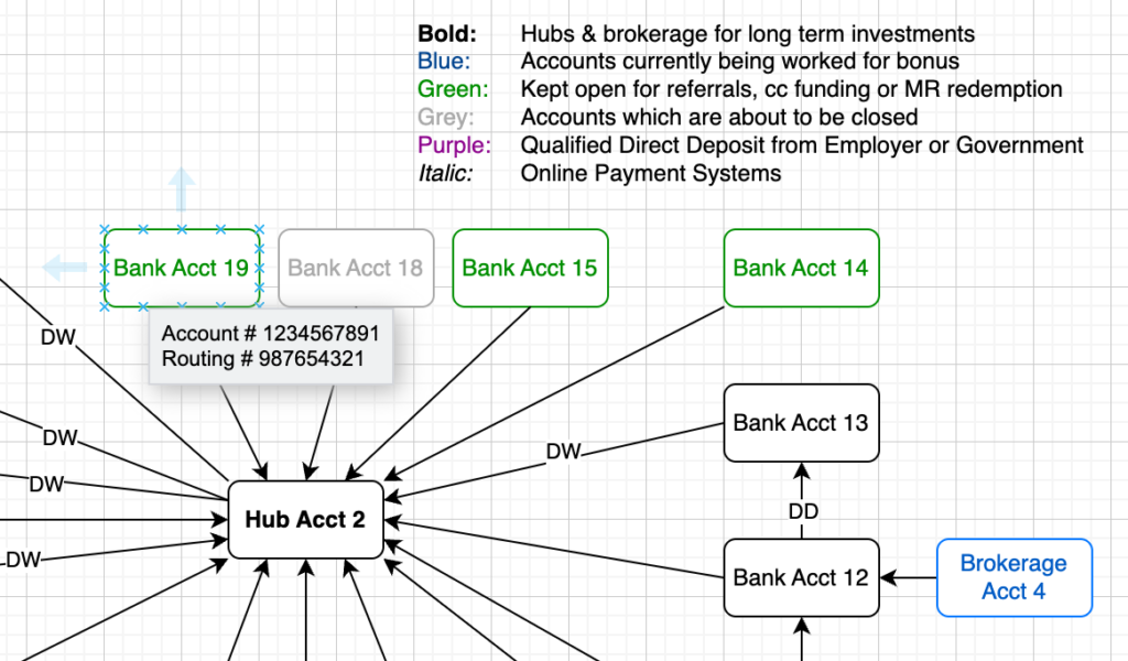
Draw.io Tooltips. You can add tooltips to every single object, including boxes and links. Do this by selecting an object such as a box which corresponds to a particular bank account. Then press Alt-Shift-T on the keyboard. Then add whatever you like, for example the account and routing number. This is exciting as it allows you to pack more information into a single page.
To view the tooltip just hover over the object for a second and it shows up.

Searches include data in Tooltips. When you do a search as mentioned above with CMD-F / CTRL-F, the data it searches also includes the text in the Tooltip which is very handy. For example, you see Cross River Bank reference in a bank portal and forget which bank it is. Well I have Cross River Bank listed as Bank Name in my tooltip for Upgrade Rewards Checking so it locates that account for me highlighting it.
Adding URL links to each object. This is very exciting! So not only can we add tooltips for each bank account, loaded with whatever info we want, we can also add URL links. Just click on the bank account and then press Alt-Shift-L to edit the link. Then choose URL and type in or paste in the URL. (You can optionally have the link instead go to another page within the Draw.io workbook.)
Locking objects. You can lock single, multiple or all objects in a sheet. Just select the one(s) you want to lock and press CMD-L on Mac OS or CTRL-L on Windows. I am getting in the habit of locking the entire page only unlocking the objects I need to update then re-locking them after updated. To select the entire page of objects, press CMD-A on Mac OS and CTRL-A on Windows.
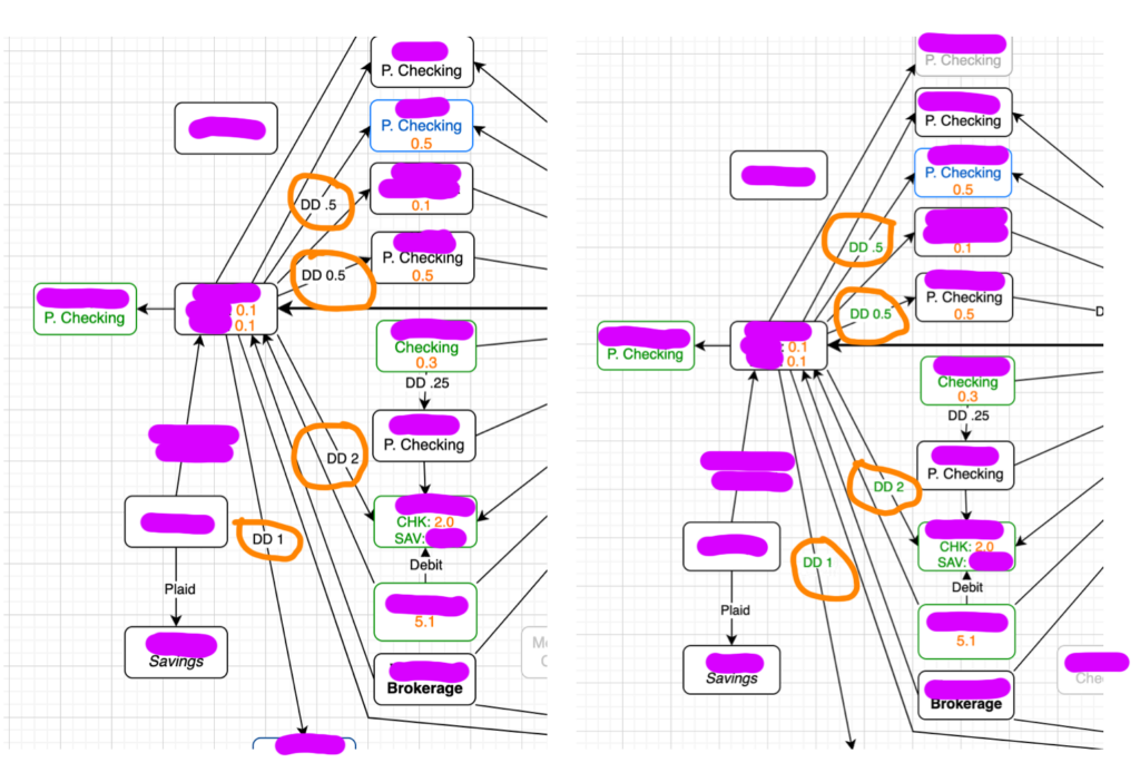
Cash balances. I’m now keeping balance information in the chart as well, finding it really helpful. In a single visual, not only do I see all accounts, their status, what I must do each month with them, the possible paths of flow of cash, but I also see the balances. See the screenshot below — amounts are in thousands of dollars, so 1.2 is $1200 and 0.5 is $500.
I round down to the nearest $100 (i.e. 0.1) for the diagram, as it makes sense to do so for simplicity but also the fact some money has to be left in the account anyways. I’m interested in what I can move around not the total balance to the penny.
The reason I use decimals for the $100 increments is because I like to keep all the numbers in K dollars. This way I can quickly visualize where all the accounts are with the largest balances.

Tracking Monthly DD’s. On the first of the month I reset my DD label colors to black. Then after I perform the monthly DD task for a particular account, I change the color to green — as shown in the screenshot below. This visually reminds me of what needs to be done for the month for account and the status. I also put the dollar amounts in K in the DD label, so “DD 1.1” means direct deposit $1,100 and “DD 0.5” means direct deposit $500.

Using multiple lines within a bank object rectangle for balances. I am now listing multiple accounts within a bank object rectangle in my diagram — for a few select accounts. E.g. a line for checking and a line for savings, or perhaps a CD as well. I put the approximate balances in K dollars on each line. Sometimes I might have to make the rectangle larger to accommodate three accounts within the same bank, as illustrated below. For CD account dollar amounts I use a very faint orange instead of the typical orange font color, since this money isn’t as liquid. See screenshot below.

Video of Bank Diagram Creation in Draw.io
The video below is a one I created and is about 7 minutes long and shows you how to create a Bank Accounts & Links Diagram from scratch with Draw.io. It also shows how to create tooltips and URL links. It also shows you how to lock and unlock objects on a page. I forgot to demo the search capability with CMD-F. Try CMD-F and type in Cross River Bank — it should highlight the Upgrade personal checking account. Tip: watch the video at 2x speed to absorb this all in half the time!

Nice blog. I recommend using Obsidian instead of Day One to keep track of banks. Much more flexible with a portable format (Markdown), supports all platforms but can be synced with iCloud or with SyncThing.
Thank you for the compliment DY. I have never heard of Obsidian but will definitely check it out! Does it support drawing / annotating with Apple Pencil on iPad? Day One seems to be pretty buggy in this regard and they don’t ever both to resolve the issues with it.
Isn’t Apple’s own journal app better? I read so many good reviews about default Journal app.
No I tried it and it is completely useless to me. Day One is far beyond it.
1) It only works on the iPhone. Not iPad nor Mac, can you believe that? I am always on my Mac when I use my journal for Bank Bonus Hunting — I type 120 WPM and like copying and pasting from web browser and other sources. Day One stores your journal entries in an encrypted cloud and the journal entries are shared across devices, including Mac, iPhone and iPad.
2) You can’t create multiple journals in Apple Journal as you can with Day One.
3) I don’t see a way to create checklists. I use the same checklist in all of my bank deal journal entries.
Those are just a few major disadvantages off the top of my head.
Also, I just tried it now: how do you even search the Apple Journal? I see no way. It’s quick and easy to search the entire set of journals or a single journal in Day One.
I missed this message somehow. I will definitely try DayOne.
You mentioned about a checklist for your bank entries, is that something you can share? Wondering if that will also be helpful for my Churning.
Check out my blog article: https://cashbackcow.io/us-bank-smartly-checking-applied-approved/
Wow, this really made my day and so excited to try this for myself. Definitely agree with you on visualizing everything in single glance.
As of now I’m using Airtable to keep track of my all bonus and I setup reminders there to send me email for all my next actions.
But this visual way will be super helpful.
Quick question, aren’t you worried about storing all account numbers in one place to be hacked ?
Glad you like it.
And yeah I agree and don’t think it is a particularly good idea to store the account numbers in diagram — I thought about this shortly after I created the video. I was just doing it as an example use of tooltip feature. You can put anything in the tooltip you like. It’s probably a good idea to have to manually log into the bank each time to retrieve the account & routing number, for security reasons.
I store all my Account and routing numbers in my 1Password manager where Ibkijd of have everything there. Turned out easy to maintain there.
Cool, I store my documents in AES-256 encrypted disk images.